Sous la maison de Jesse Jacobs figure dans la sélection officielle du prochain festival d'Angoulême !
mardi 20 novembre 2018 - Général
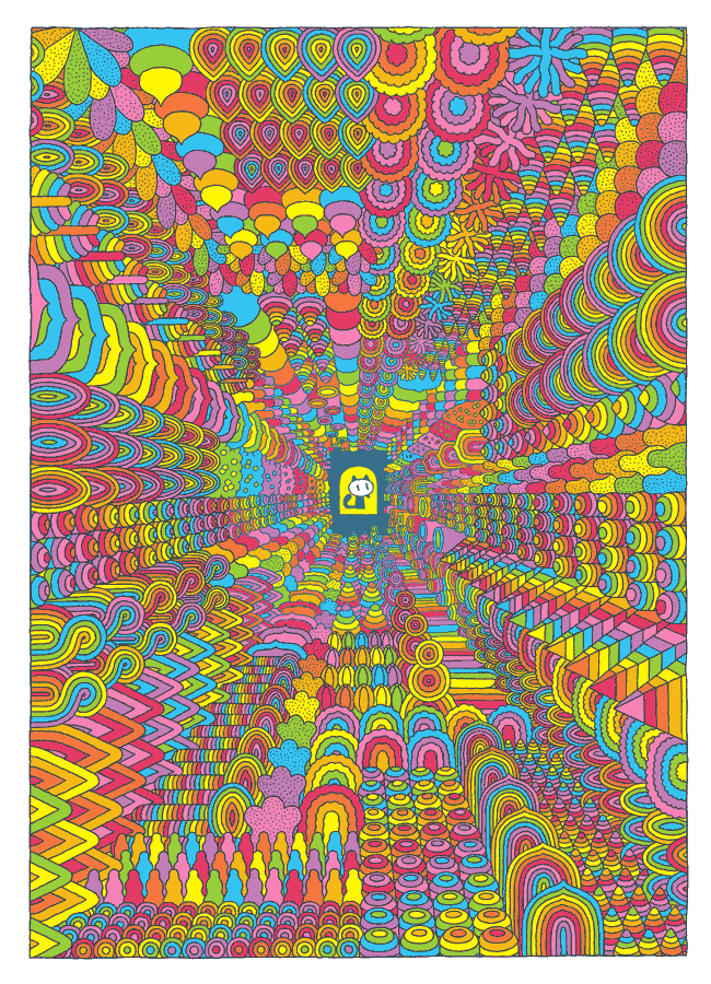
Sous la maison de Jesse Jacobs figure dans la sélection officielle du prochain festival d'Angoulême !
/// aucun commentaire ///
jeudi 8 novembre 2018 - Général
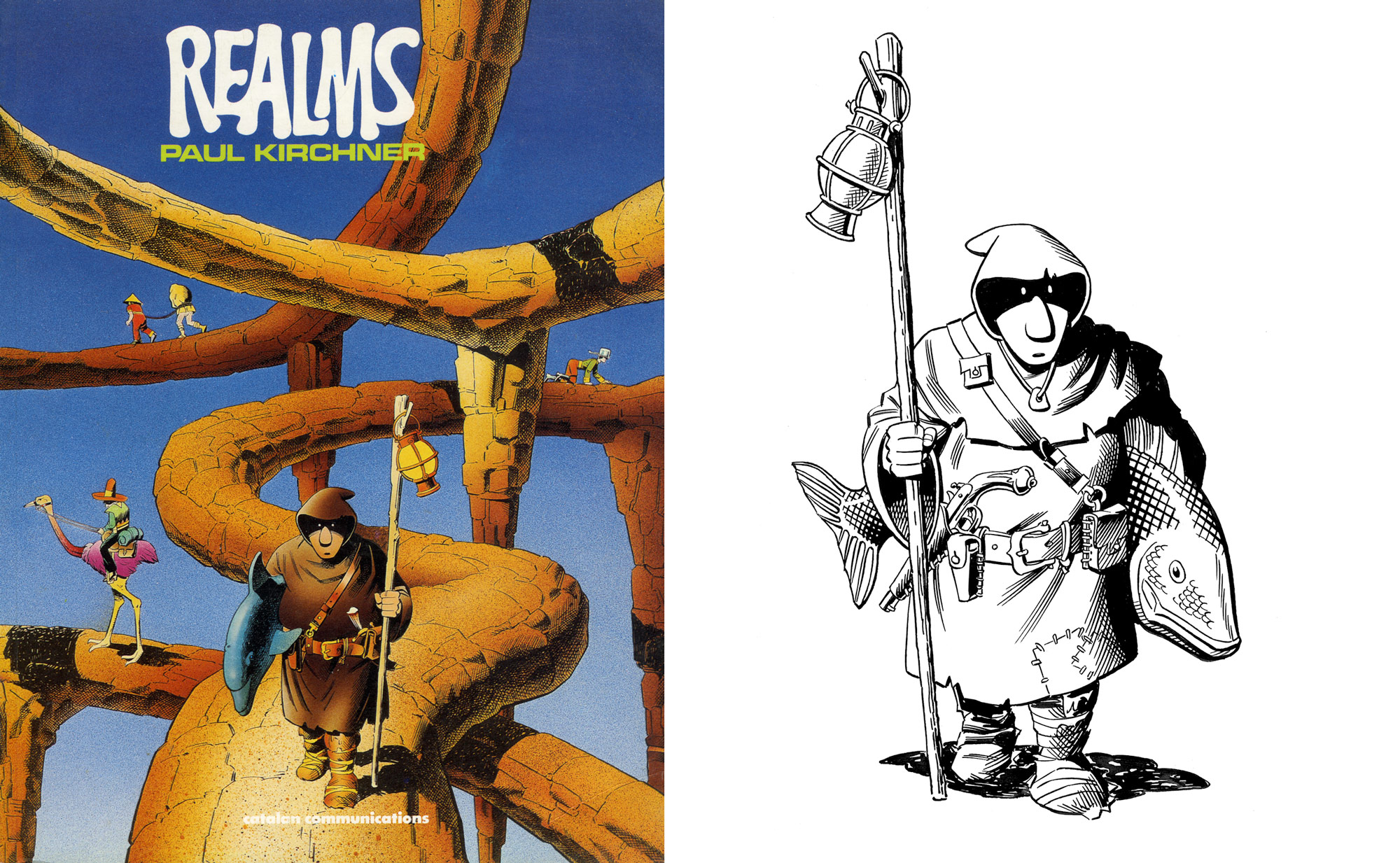
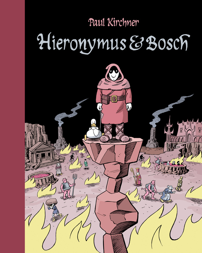
On the occasion of the release of his new book Hieronymus & Bosch, Paul Kirchner tells us the story behind the strip.
The character that would one day become Hieronymus first appeared on the cover of my 1987 anthology, Realms, in which he is one of a number of odd characters traveling a network of floating stone paths. This Hieronymus had a staff with a lantern atop it, a dagger in his belt, and a dolphin under his arm. I liked the look of him and did a different version, which I had printed on my envelopes. This one had a tuna instead of a dolphin and a flintlock pistol instead of a dagger.
Around 2005, I began thinking about a comic strip to be set in Hell, specifically Hieronymus Bosch's vision of Hell. I kept a file of sketches and notes, but I was never able to develop any ideas that worked. I read several books on Hell, looking for direction. Dante was too daunting, so I tried Dante's Inferno in Plain English. Still too dense for me, I resorted to an excellent graphic novel, Dante's Inferno, by Hunt Emerson and Kevin Jackson. To the extent I was influenced by Dante’s vision, it was mostly in having a variety of punishment, each appropriate to the specific sin. I also read Inferno and Escape From Hell by Larry Niven and Jerry Pournelle. These books, especially the second, were inspirational. The story follows Dante's vision but introduces the rather Buddhist concept that the residents of Hell have chosen to be there, if only subconsciously. They need to work out some basic flaw in their nature and once they have done so they are free to leave.
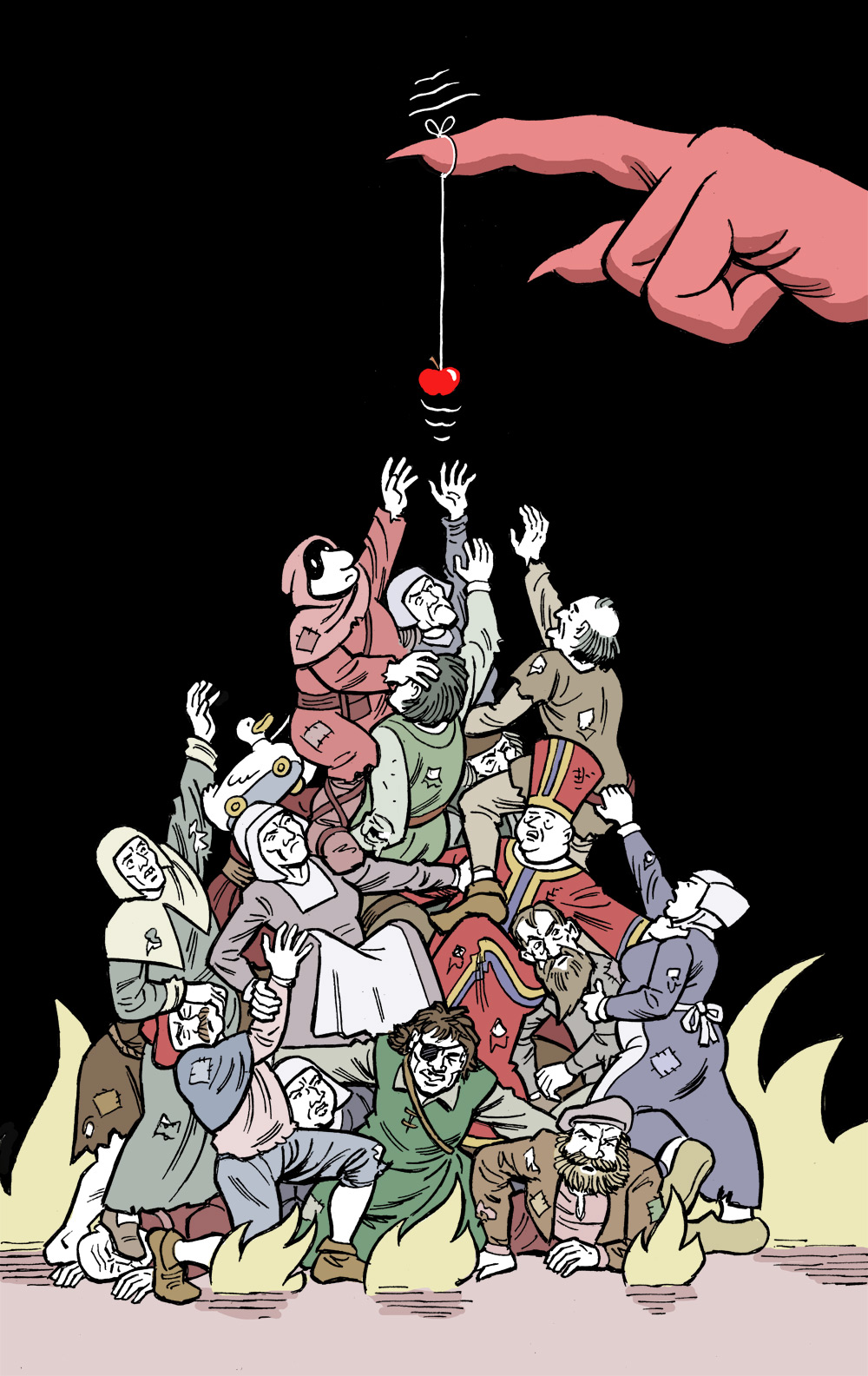
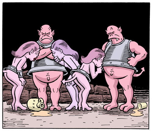
In 2014 I gave up the idea of using Bosch's imagery and went with my own vision of Hell. I visualized it as being somewhat like real life, except that it’s gloomy and shabby and everything always goes terribly wrong. It has an eternally black, starless sky, volcanoes spewing noxious fumes, and a landscape spotted with tumble-down ruins. Occasionally one comes across an apple—a delicious red apple!—but it is almost always the bait for a practical joke. One is bullied by demons, but not to the extent that one sees in medieval depictions. The residents are not hacked into pieces or impaled on spikes, but poked, prodded, and shat upon. People often talk about all the shit they have to put up with in life, so I figured that if they end up in Hell they will have to put up with a great deal more. My Hell is less about torment than frustration, aggravation, and humiliation, and shit seemed a good way to depict that.
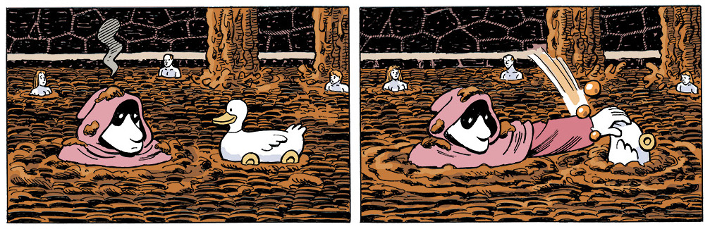
I needed to make some changes to Hieronymus in order to fit him into my Hell. Gone was the pistol, of course--that would have been confiscated at the gate. Gone also was the staff and the fish, as he would need his hands free to perform various functions. Instead of holding a fish, he now pulls a toy wooden duck behind him. It is not very good company, but he's stuck with it.
As far as style, I wanted to give it a rough look like a woodcut. I'm not sure I succeeded in that, but the shading at least is done like the lines in a woodcut rather than the cross-hatching I used for the bus. I never ruled a line in Hieronymus & Bosch as I wanted everything to look a little irregular.
At the time, I was calling my strip "Hell Mall." I drew up the first half dozen strips around the same time that I was drawing the new bus strips that were published in the bus 2. I had submitted the bus strips to Ryan Flanders, an editor at MAD magazine, but he warned me that if MAD published them they would take ownership of the entire property, which was unacceptable to me. Unsure how far I could take "Hell Mall," I submitted that to MAD, willing to give up the rights if they wanted it. MAD turned it down. Ryan wrote, "We've decided that 'Hell Mall' isn't a good fit for MAD. We took it under very serious consideration, but we ultimately decided it's too conceptual. We prefer to give it to 'em straight."
In retrospect, I'm very glad that MAD had turned it down. MAD publishes only bimonthly and many of its regular comics are not featured in every issue, so my strip--which would no longer actually be mine-- would have earned me little money and gotten little exposure.
Ideas kept coming to me and I kept doing strips, hoping to eventually have enough for a book. I played with various names for the strip, and finally decided upon "Hieronymus & Bosch," the names I had given the man and duck. When I was doing the bus, it had never occurred to me to give the commuter a name, but I felt that this character would be easier to relate to if he had one.
This cartoon is some ways similar and in others quite different than the bus. Both star a hapless character who seems bewildered by the world he inhabits, but who attempts to navigate it as best he can. Both strips use visual gags with no dialog. The style is more cartoonish, which is a way to soften the cruelty and put it in the realm of a Warner Bros. cartoon. (Though I did decide to put little penises on the demons so they wouldn't be mistaken for Disney characters.) Both strips use surrealistic jokes, but the bus uses them almost exclusively while Hieronymus & Bosch uses more physical comedy of the Laurel & Hardy variety. My father used to dismiss slapstick as the lowest form of humor, but as I see it, if it makes me laugh it’s doing its job.
In October 2016, when I had completed 48 strips, I got an email from Peter Karpick, a cartoon editor at the entertainment company Adult Swim. He asked if I would like to develop a series for the comics section of their website. I told him I had already developed a series and would be happy to have them use it as long as I retained ownership and publication rights. They agreed to this and paid me very well for the 19 strips they ran at their site. Those strips are currently archived on the Adult Swim comics page.
By the summer of 2018, when I had over 80 strips, I did the additional material necessary for the collection of them to be published by Editions Tanibis. This included front and back covers; the map on the end papers; five comic pages to introduce Hieronymus and Bosch and show how they ended up in Hell; some short strips based on ideas that didn't require a full page; and an afterword from Satan.
— Paul Kirchner
/// aucun commentaire ///
mercredi 19 septembre 2018 - En librairies
Aujourd'hui en librairie :
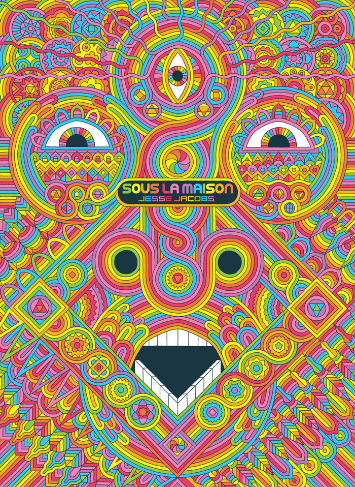
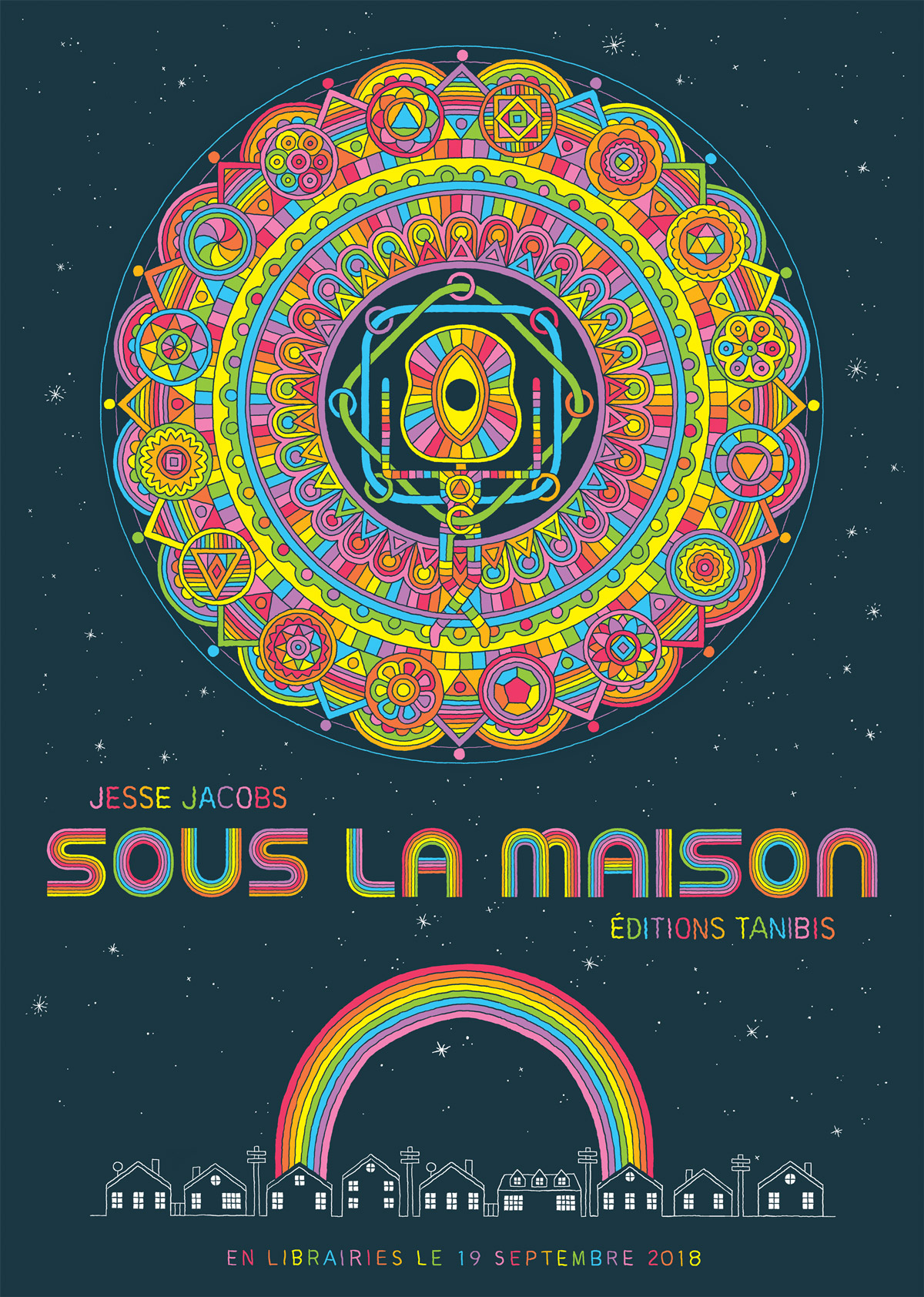
La voie de l’éveil intérieur est longue et délicate. Sauf si l’on trouve un raccourci dans son sous-sol, via une machine à laver magique… C’est ce qui arrive à Daisy, une jeune adolescente nouvellement arrivée dans son lycée et qui a du mal à se faire des amis. Une dimension supérieure, pleine de vibrations étranges et de sensations bizarres, habituellement cachée et uniquement accessible aux esprits éclairés, devient son terrain de jeux sacré. Mais, la pureté et l’innocence n’ayant qu’un temps, ce jardin d’Eden sera rapidement envahi et profané par d’autres, moins sensibles à sa fragilité.
En 96 pages, Jesse Jacobs nous raconte cette fable new age de paradis perdu et d’enfants plus tout à fait innocents avec un dessin faussement naïf et une approche détonante des couleurs, opposant la monochromie de la réalité suburbaine subie par les personnages à la palette acidulée du monde artificiel dans lequel ils se réfugient. Comme dans ses autres ouvrages publiés chez Tanibis, les pages purement narratives sont entrecoupées de séquences fantasmagoriques dans lesquelles Jacobs, mêlant régularité géométrique et imagination psychédélique, donne à voir les créatures et les sensations indicibles qui peuplent cet espace secret.
Troisième roman graphique de Jesse Jacobs, Sous la maison a été récompensé au Canada par le Doug Wright Award du meilleur album et nominé aux États-Unis pour les Eisner Awards.
/// aucun commentaire ///
samedi 1 septembre 2018 - Bientôt...
/// aucun commentaire ///
mardi 5 juin 2018 - Nouveauté
Maintenant disponible :
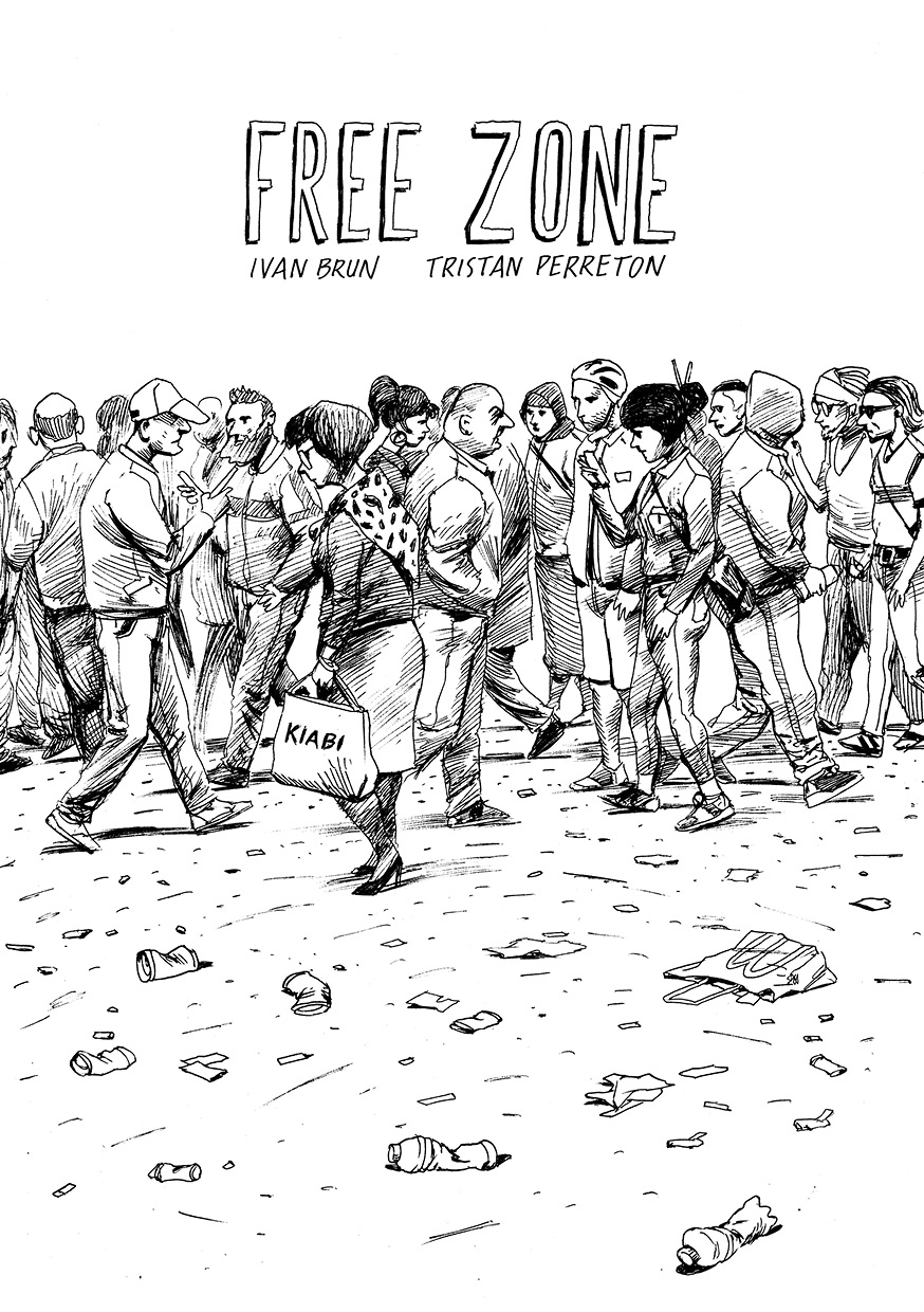
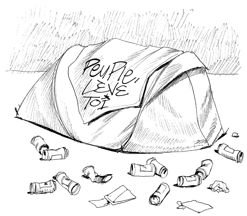
Les auteurs de Prof. Fall se retrouvent avec Free Zone, récit réalisé entre juin et novembre 2017 selon un protocole bien particulier : suivant une trame écrite à l'avance par Tristan Perreton, Ivan Brun a réalisé chaque dessin sous les yeux d'un lecteur lors de séances de dédicaces, puis l'a photographié afin que le lecteur puisse emporter l'original.
Les 22 dessins forment un récit âpre où il est question d'une tente plantée sur la voie publique, de badauds et de misère sociale…
Free Zone est uniquement disponible sur notre site web et en festivals.
/// aucun commentaire ///
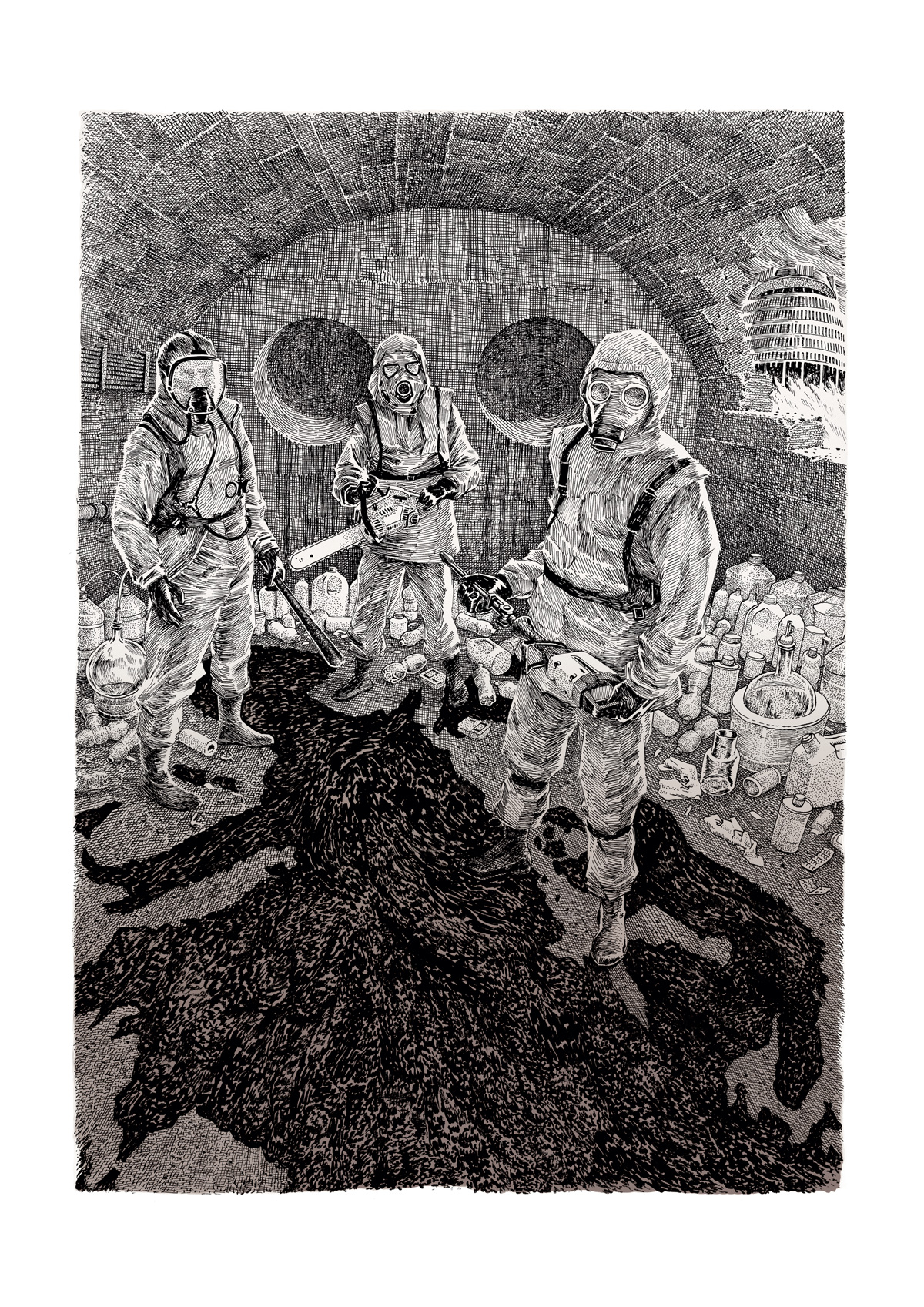
mardi 27 mars 2018 - Affiches
Initialement réalisée pour le groupe de sludge métal néo-zélandais Meth Drinker, une nouvelle affiche signée Ivan Brun est disponible dans notre boutique en ligne.
/// aucun commentaire ///
« billets précédents - page 4 de 34 - billets suivants »